Meloni VS Schlein
A visualisation that tries to compare press coverage of Italian Prime Minister Giorgia Meloni and lead of opposition Elly Schlein
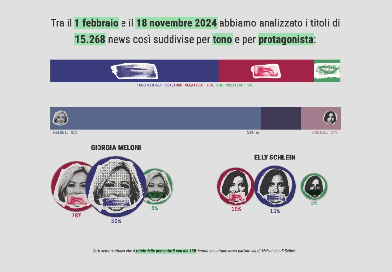
The year 2024 started with something we had never seen before in Italian politics: both the Prime Minister and the leader of the main opposition party were women. It was clear that Giorgia Meloni, the Prime Minister, had strong popular support, and that most of those opposing the government were Elly Schlein's supporters. What I wanted to understand was how this sentiment was reflected in the Italian press.

To do this, I wrote a NodeJS script to consume the few public APIs available that index the Italian press and save references to stories published about Meloni and Schlein. Another NodeJS application was used to scrape the content of the saved links (specifically the title, description, and og:tags attributes), and to update the metadata associated with each story. A third script was used to parse this metadata with Wit.ai to refine the tagging and extract sentiment from the titles. I then aggregated the generated tags into topics to check whether the sentiment of the press differed depending on whether the subject of the story was Meloni or Schlein.
I then created a web API to allow a website to access the enriched data. The website was built with SvelteJS, and the charts are rendered as SVG using D3JS.
I tried to keep the design as simple as possible, but I also wanted to use a visual language that made it clear this wasn’t a serious project, but rather a kind of joke. That's why I created cut-outs of the subjects’ heads, and why sentiment is represented with mouths and colors: a smiling mouth represents a positive sentiment (green), a neutral mouth a neutral sentiment (blue), and a sad mouth a negative sentiment (red). Each of the protagonists is also associated with a specific color.
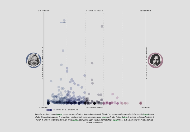
To show all the different aggregations, I created several charts: a stacked bar chart showing the percentage of stories about Meloni, Schlein, or both; an area chart that, for each of them, displays the percentage of computed sentiments; a matrix that shows whether certain keywords are more often associated with Meloni or Schlein; and a series of bar charts that illustrate how the coverage of specific topics has changed over time.